
Client
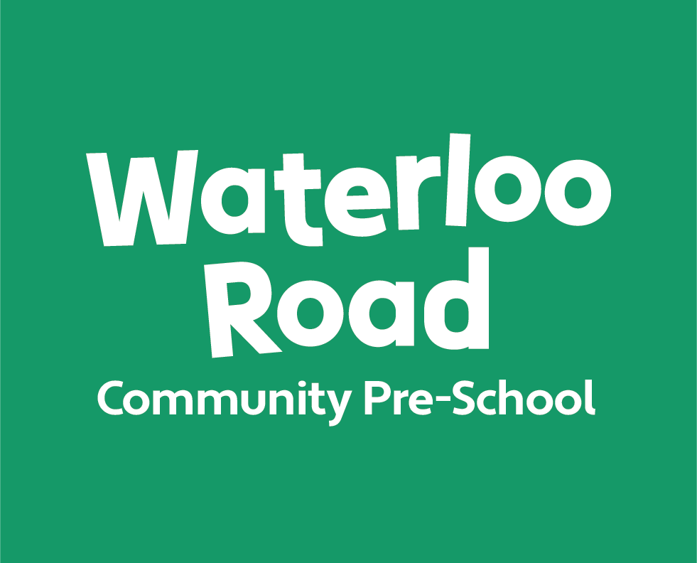
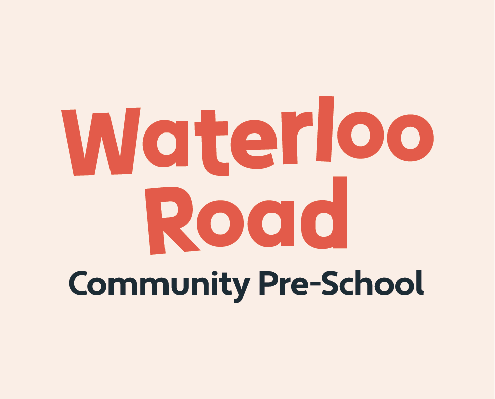
Waterloo Road Community Pre-School
Waterloo Road Community Pre-School
Deliverables
Campaign identity
Creative direction
Campaign identity
Creative direction
Waterloo Road Community Pre-school wanted to update their brand to reposition the preschool as a high-quality, nurturing early years setting through a visual rebrand and communications toolkit that reflected it’s values, enhanced visibility, and supported fundraising and community engagement.
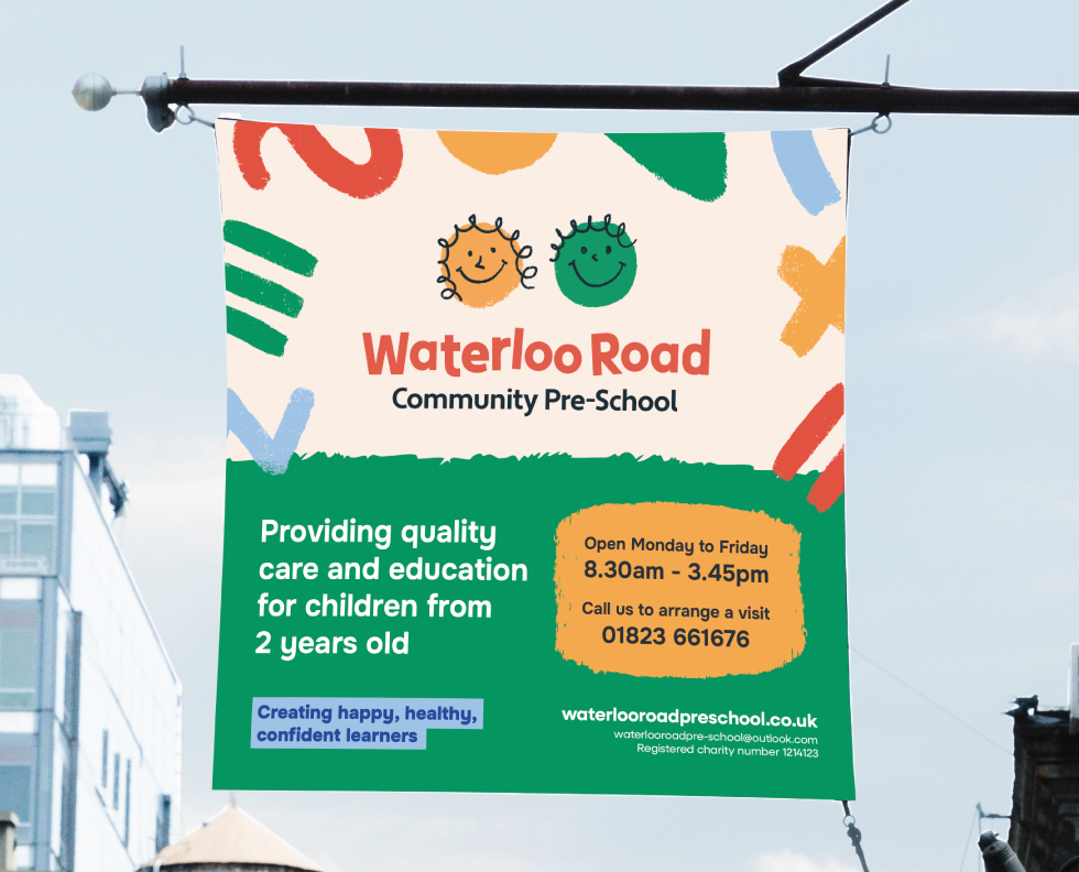
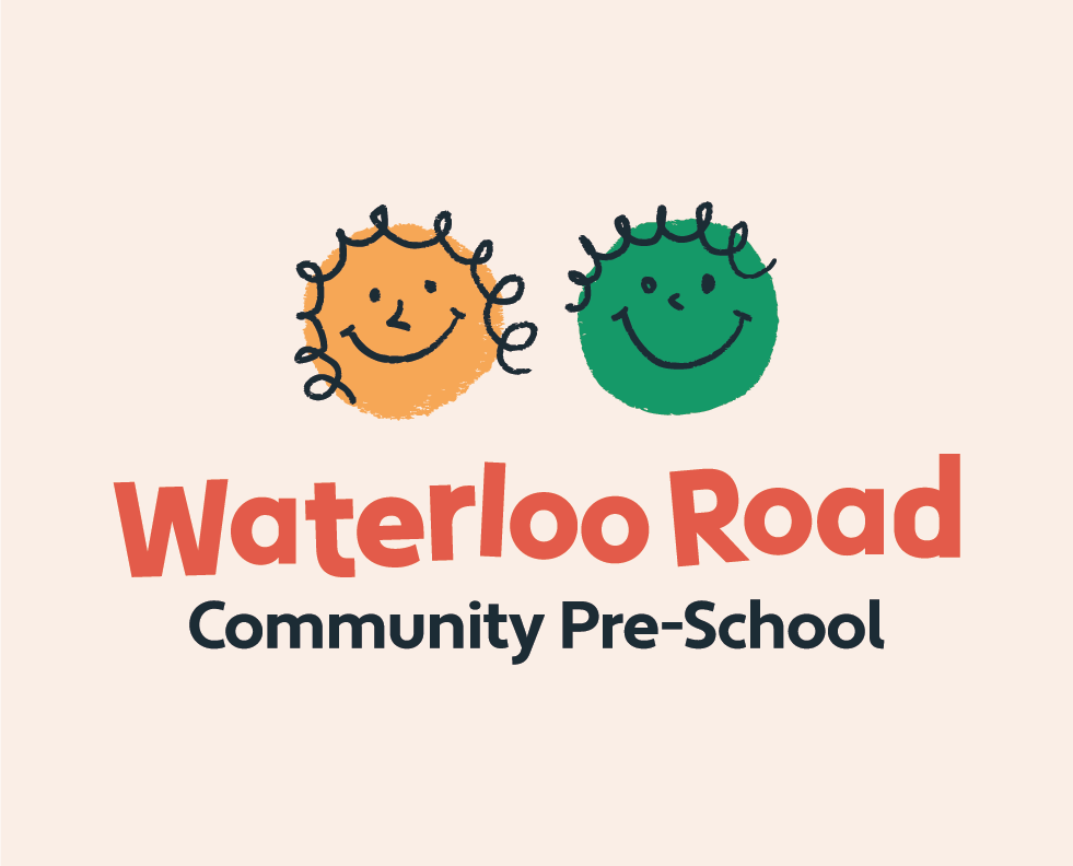
The old visual identity no longer reflected the warmth, care, and quality of experience offered. The refreshed brand better communicates the preschool’s values, child-led learning, a welcoming atmosphere, and a focus on happy, healthy, confident children, while creating a more professional and cohesive look across signage, uniforms, and communications.
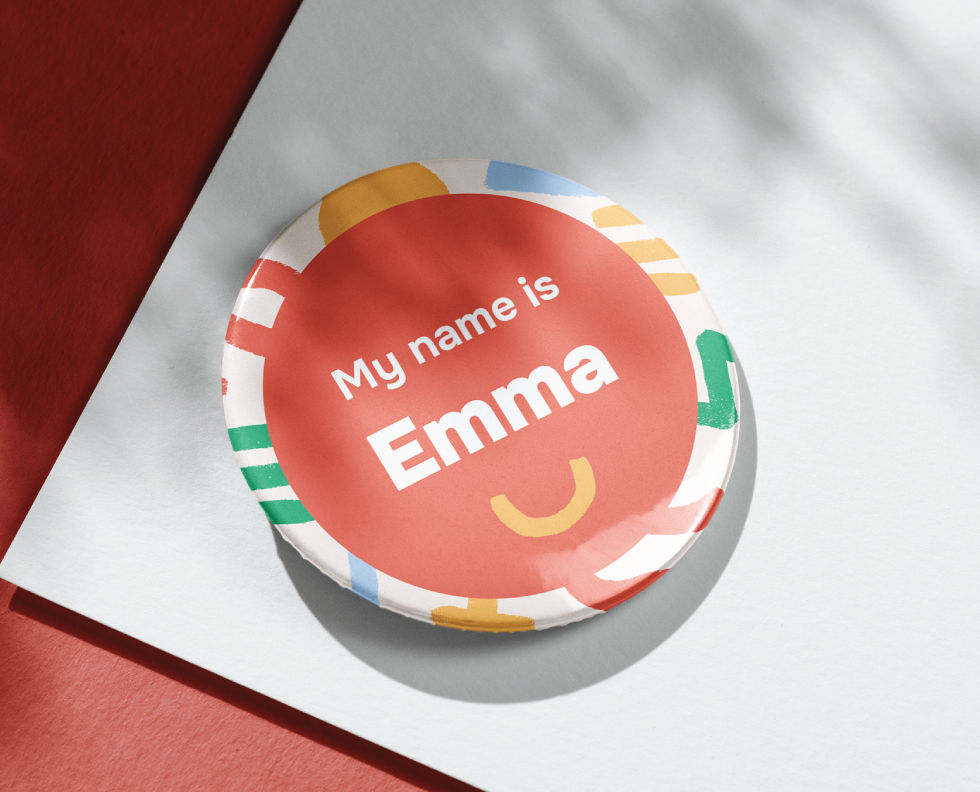
Part of the brief for Waterloo Road involved creating a brand toolkit that the team at the pre-school could easily use to create simple templates for social media and events.
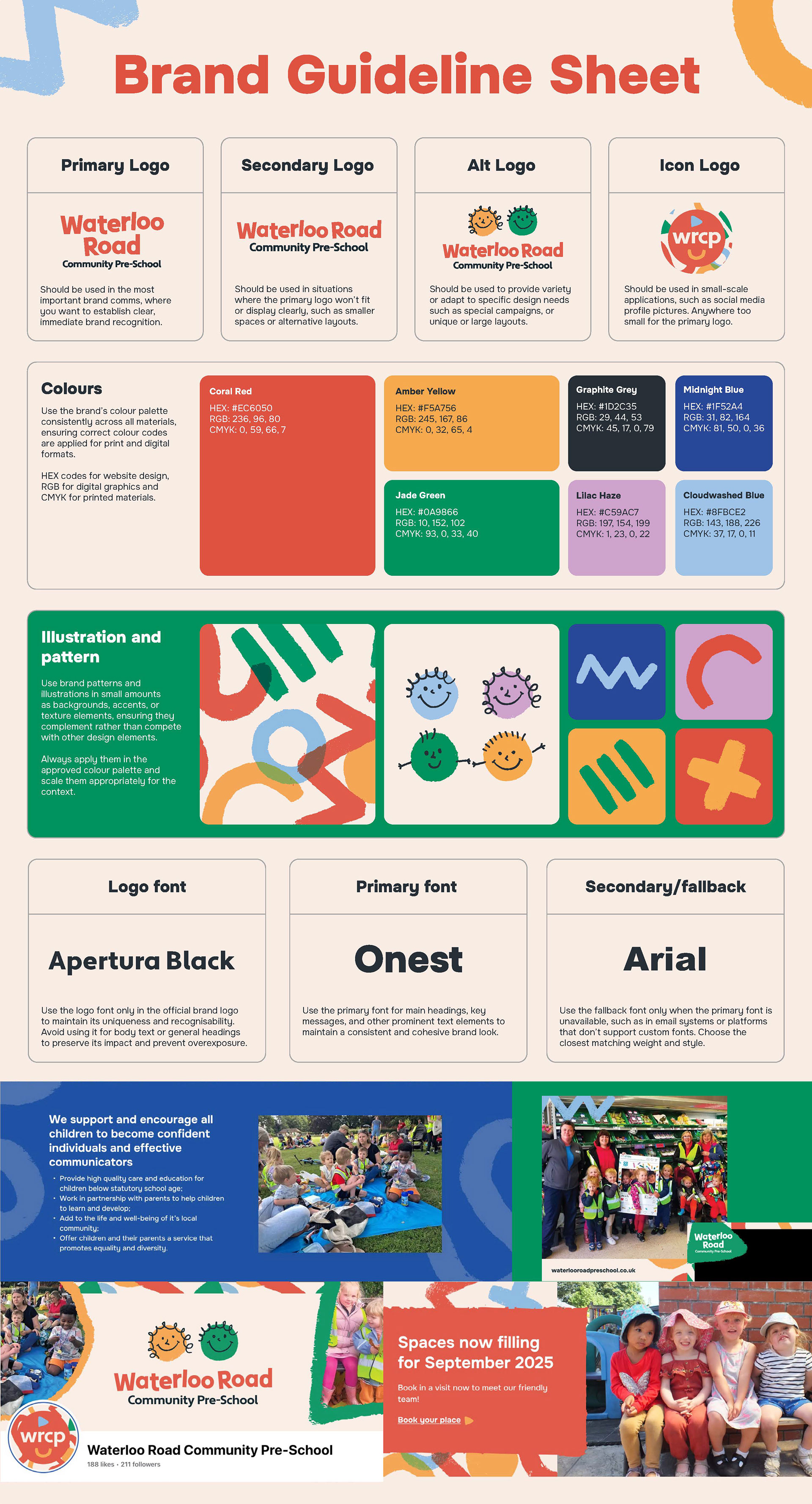
The playful, crayon-textured pattern celebrates the spirit of early years discovery through colour, shape, and joyful movement. It’s designed to complement the Waterloo Road Community Pre- School identity while bringing extra character and warmth to branded materials.
The colour palette is carefully crafted to reflect the vibrant, nurturing, and joyful environment of Waterloo Road Community Pre-School. Each hue is selected to be both visually engaging for children and clearly functional for communication with adults, creating a playful but professional visual identity.